This soon to be retired ArcGIS Pro course on ESRI Academy was the longest and one of the best ESRI Academy courses I’ve taken so far. After adding the data to the map, we:
- created a hillshade of the elevation
- viewed underground data in 3D
- classified a feature layer
- analyzed and symbolized raster data
- created transparancies
- created a map layout
- created a project package
- shared a map web layer with a subset of features
- and more
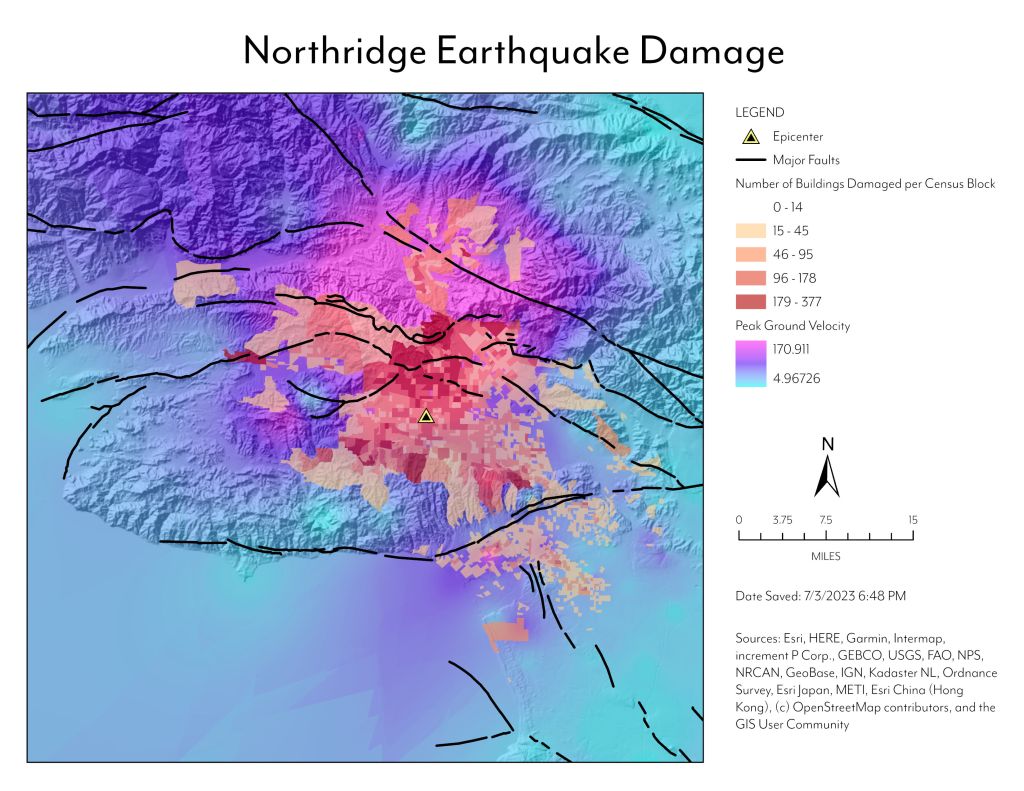
To create the map layout shown here I went above and beyond the course information to clean up the symbology to make the epicenter more visible. ESRI had us choose red for the epicenter but I felt that made it hard to see against the building damage, so chose a yellow that would stand out. I also made sure all the fonts were the same, adjusted the scale bar formatting, and removed the redundant category labels from the legend. I also felt their layout did not make the best use of the paper space, so I adjusted the layout to what I feel is a more balanced design.
Overall, this was an excellent review and I scored 100% on the course.
