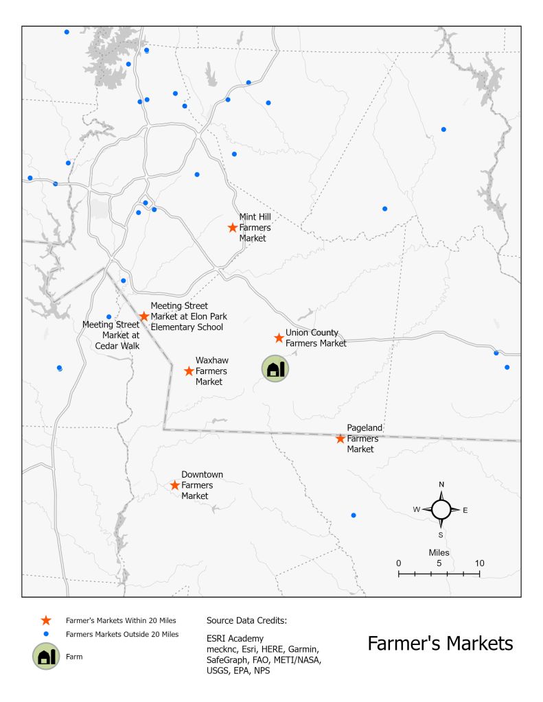
For this ESRI Academy analysis, I took existing farmer’s market locations and selected only those within a 20 mile radius of the farm.
I went a few steps further by separating the selected layer out so they could have a different symbology than farmer’s markets outside of 20 miles. I also constrained the labels so they wouldn’t overlap with too many basemap features but would still stay as part of the feature class. I used a basemap that would be as simple as possible with the assumption that the farmer would be familiar with the region. I customized the colors and sizes of the symbols and renamed the layers. I created a layout where I moved the auto created dynamic label off the map frame. I adjusted the scale to a mileage that made sense with the measurements of the features. I had to make multiple edits to the properties of the legend to create a clean look. Finally, I exported the map as a web .jpg with the results shown below.